
Project at a Glance
The Booking Mobile App is a mobile-first hotel and property reservation application designed to simplify search workflows, reduce interface clutter, and increase booking completions.
This case study documents how usability analysis shaped the reservation experience, from interactive listing maps to sticky checkout bars, culminating in a responsive React Native and Firebase implementation.
High mobile drop-off
Users frequently abandoned booking journeys due to heavy search listings, multi-page filters, and restrictive account registration steps.
Linear interaction layout
I designed a clear search-to-checkout flow, adding sticky action sheets, clear pricing cards, and non-intrusive registration flows.
Seamless check-ins
A highly responsive, native-feeling navigation structure that reduces search fatigue and issues digital check-in QR credentials instantly.
Understanding the Context
Mobile booking applications frequently suffer from high user drop-off rates during the search-to-checkout flow. Users are easily overwhelmed by dense text lists, complex search filters, and unexpected login gates.
This project focused on redesigning a mobile-first booking interface to streamline property comparison, simplify booking duration adjustments, and deliver immediate booking confirmations using React Native.
The Usability Problems
Our initial usability audit of standard mobile reservation systems highlighted three critical barriers to conversion:
1. Cluttered Discovery
Listings packed with excessive text details and nested icons made comparing multiple room rates difficult on compact mobile displays.
2. Filter Modal Fatigue
Complex multi-layer filter sheets forced users to tap repeatedly to refine simple location parameters, leading to app abandonment.
3. Intrusive Sign-up Gates
Forcing users to register profiles before showing total pricing summaries or availability schedules caused immediate friction.
Target Users
The app's primary users are business travelers and vacation seekers who prioritize speed, transparent pricing, and instant bookings. They need to find, review, and reserve hotel rooms quickly on their mobile devices, often while in transit or on tight schedules.
Designing the Booking Journey
We structured the booking flow into four seamless, linear steps to guide the user from discovery to check-in:
High-quality cards, clear rating badges, and price overlays.
Structured amenity tabs, user ratings, and details.
Single-page date picker and price breakdown summary.
Digital QR check-in voucher issued immediately.
Key UX and Product Decisions
To minimize user drop-offs, the interaction model was rebuilt around context and speed:
Problem: Standard list views felt cluttered, forcing travelers to load and back out of multiple pages to check proximity to local landmarks.
Decision: Developed a cards layout pairing high-quality hotel images directly with an interactive map route thumbnail. Nightly rates and user reviews were highlighted in bold badges.
Result: Users can assess both price and exact location at a glance from the primary feed, reducing search fatigue.
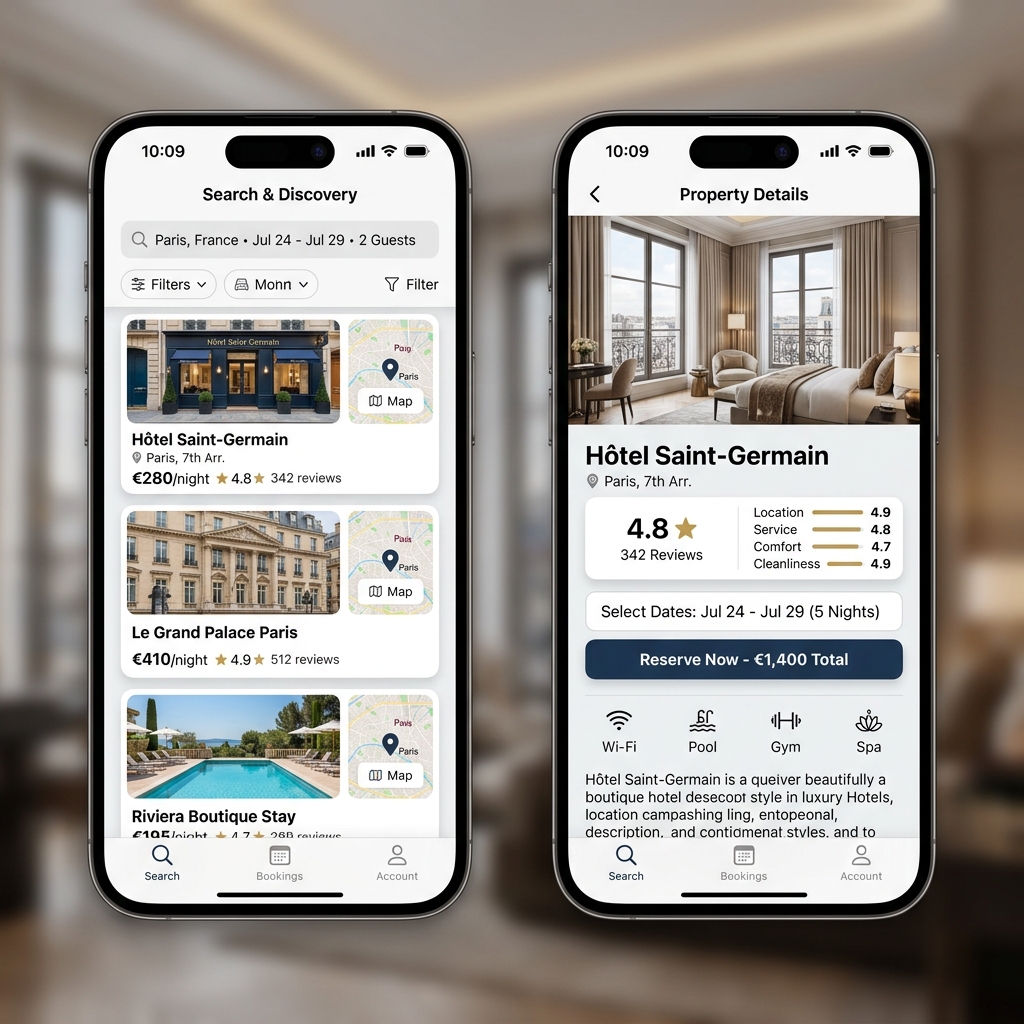
Problem: Hotel detail pages contain long reviews and amenity details. Users had to scroll all the way back up to locate the booking actions.
Decision: Fixed a sticky action sheet to the bottom of the property details view. This sheet displays the base nightly rate and a prominent "Book Now" CTA.
Result: Booking remains a single tap away at any point on the page, facilitating immediate checkouts.
Handling System States
To prevent drop-off during slow cellular connections or queries with no matches, we built:
Skeleton Loading
Used grey animation skeletons that mimic card shapes, reducing perceived loading times while content fetches.
Clear Empty States
Designed helpful empty search states that prompt: "Try broadening your calendar dates or adjusting price limits."
Friendly Offline Handling
Built connection error warnings with retry buttons, caching previous search arrays locally.
React Native & Backend Integration
The application frontend is built with React Native and Expo, facilitating cross-platform deployment, and integrates with Firebase/Firestore for database management.
Mobile Responsive Layouts
- Dynamic dimensions calculation for varied screen scales
- Keyboard-avoiding views for input form sheets
- Touch layouts supporting safe margins (iOS Notch safe-zones)
- Native-feeling touch animations
Real-Time Data Sync
- Firebase Auth listener monitoring user reservations
- Firestore date lock records preventing double booking
- Local cache saving recently viewed hotels
- Instant QR check-in pass validation logic
Show Data Architecture & Reservation Rules
Firestore document trees are structured for quick transaction updates:
- Properties catalog: Contains location tags, nightly base rates, and structural amenities.
- Availability subcollection: Logs reserved dates to validate calendar choices.
- Reservations: Links authenticated client IDs to checked-in hotel vouchers.
- Price Calculations: Automatically checks date arrays to compute subtotal taxes.
Outcomes & Feedback
Usability feedback and operational test cycles showed positive improvements:
Users can complete hotel search to check-in confirmation within a linear 4-step path.
Removing intrusive login wall gates allows users to explore complete prices first, retaining high checkout intent.
High contrast buttons and clear typography styles ensure legibility under outdoor travel settings.
Standardized listing layout widgets and date sheets accelerated future development.
Selected Interface Gallery
Selected screens from the Booking Application UI:
High quality images, map indicators, and transparent pricing.
Tabbed amenities, reviews, and sticky booking bar.
Reflections and Key Learnings
-
•
Prioritize speed on mobile devices
Users traveling or in transit prioritize immediate answers. Reducing page weights and layout transitions makes the application feel significantly faster.
-
•
Design for outdoor conditions
Bright sunlight makes low-contrast text unreadable. Enforcing high contrast ratios and large tap targets (minimum 48px) is a critical usability requirement.
-
•
Optimize data inputs
Date pickers and selection lists must be built specifically for thumbs. Replacing generic desktop inputs with custom calendar sheets reduces booking friction.
This mobile application case study highlights my ability to audit mobile interfaces, design clear workflows, and implement responsive native-feeling panels.
Designing High-Converting Mobile Products
This project demonstrates how I prioritize mobile interactions, design large touch interfaces, and coordinate React Native environments to streamline reservation flows.
Note: The production codebase is private as it contains client API key mappings.