
Project at a Glance
The E-commerce Experience project focused on optimizing cart checkouts, layout scaling, and product filtering for a regional clothing retailer, simplifying multi-brand searches on mobile viewports.
By structuring interaction models around non-disruptive cart drawers and single-page payment checkouts, we significantly reduced checkout drop-offs.
Cart abandonment
Complex multi-page checkout sheets, full-page redirects on item additions, and cluttered filters drove shoppers away.
Slide-out cart drawer
I designed a slide-out cart summary drawer and consolidated shipping, billing, and payment screens into a single-page layout.
Reusable component flow
A highly responsive React + Tailwind application framework backed by structured filters, swatches, and accessible targets.
Context & Background
In online retail, cart abandonment is a major challenge, with friction in navigation and complex checkout flows accounting for a significant portion of lost sales.
This project focused on redesigning a multi-brand clothing e-commerce website to create a smoother, faster purchasing experience on both desktop and mobile screens.
The Usability Problems
Usability reviews of the previous platform highlighted three major obstacles to conversion:
1. Disruptive Cart Redirects
Adding items redirected shoppers to a full cart page, interrupting discovery loops and slowing down multi-item orders.
2. Confusing Navigation
Deeply nested category lists made it difficult for users to find specific sizes, styles, or colors quickly.
3. Overwhelming Checkouts
Requiring shoppers to navigate through multiple separate steps to complete simple address updates caused drop-offs.
Target Users
The primary users are online retail shoppers who expect fast browsing, immediate cart validation, and short, straightforward checkout paths.
The Customer Journey
We mapped the customer journey into three key stages:
Fast filtering by size, color, and price directly from the product grid.
Quick-view details and simple size selection with immediate feedback.
Slide-out cart validation followed by a single-page checkout flow.
Key UX and Product Decisions
To minimize checkout friction, we refined major e-commerce patterns:
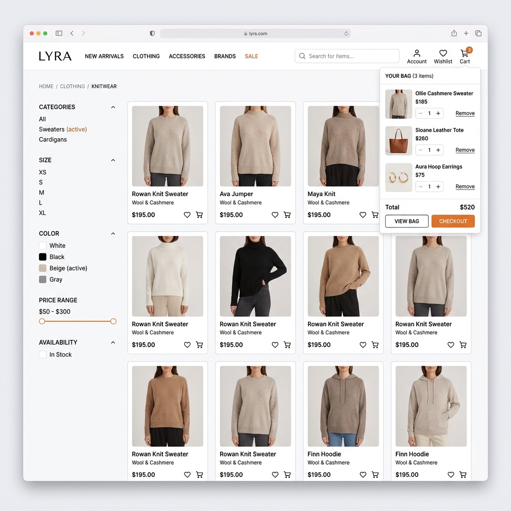
Problem: Redirecting shoppers to a separate cart page after adding an item interrupted their browsing flow and slowed down multi-item orders.
Decision: Replaced the full-page redirect with a slide-out cart drawer that displays item summaries, quantity adjusters, and subtotal details.
Result: Shoppers can confirm added items instantly and continue browsing catalog listings, maintaining shopping momentum.
Problem: Standard multi-page checkout flows felt slow, frustrating, and difficult to manage on mobile phone viewports.
Decision: Consolidated the shipping, billing, and payment method details into a single-page accordion checkout flow.
Result: Shoppers can complete purchases in a single view with fewer reloads, reducing checkout friction.
Reusable UI Component Architecture
To ensure visual consistency and code efficiency, we built a library of reusable interface components:
Product Listing Cards
Standardized cards displaying product images, titles, pricing labels, rating badges, and add-to-cart triggers.
Sidebar Filter Accordions
Collapsible panels containing custom inputs for color swatches, size tabs, and price slider tracks.
Quantity Selectors
Accessible item counters with clear interactive margins, error checks, and validation states.
Frontend Implementation
Using React and Tailwind CSS, we focused on building a clean, responsive, and accessible interface:
Responsive Grid Layouts
- Tailwind CSS grid classes scaling from 1-column mobile feeds to 4-column desktop listings
- Flex containers automatically adjusting filters sidebars
- Responsive modal sheets collapsing safely
Web Accessibility & SEO
- Explicit aria-labels on rating stars and cart buttons
- Focus visible borders on all interactive inputs
- Clean image alt descriptions and correct header hierarchies
Show Data Architecture & Cart State Rules
The client-side state is handled in React Context to ensure fast cart updates:
- Cart state: Maintained in a global context provider to sync navbar counts, drawer listing details, and checkout subtotals.
- Filters context: Caches active choices (color, size, price) to compute catalog results.
- Local storage caching: Saves active carts locally to preserve shopper drafts across browser reloads.
Outcomes & Feedback
Feedback from the checkout redesign showed positive usability gains:
Consolidating inputs into a single-page accordion reduced average checkout times.
The slide-out drawer allows shoppers to confirm additions instantly without page reloads, improving shopping momentum.
Building modular inputs, swatch buttons, and filters speeded up future product catalog expansions.
Enforcing Tailwind CSS grid transitions ensured a high-quality display on both desktop and mobile viewports.
Selected Interface Gallery
Selected screens from the E-commerce Experience UI:
Responsive grid scaling from mobile layouts to 4-column desktop listings.
Single-page accordion interface containing billing and payment inputs.
Reflections and Key Learnings
-
•
Design tokens ensure consistency
Predefining core colors, shadows, and button layouts inside Tailwind CSS variables simplified form styling and kept components visually cohesive.
-
•
Minimize steps in transaction flows
Every additional input field increases user friction. Consolidating checkout steps into a single accordion reduces drop-offs.
-
•
Non-disruptive feedback matters
Letting shoppers add items and review cart calculations in a slide-out drawer keeps them engaged with discovery, increasing order sizes.
This responsive e-commerce UX case study highlights my ability to audit web interfaces, design modular component libraries, and implement high-converting payment layouts.
Designing High-Converting E-commerce Products
This project demonstrates how I structure product catalog navigation, design cart validation drawers, and configure responsive payment checkouts.
Note: The production codebase is private as it contains client payment gateway keys.